Demo Articles
Demo Content
- Detalles
- Categoría de nivel principal o raíz: Contenidos
The demo for Refraction utilises a large stock of custom code and styling to make the most of every content item and show what Refraction can do. This basically means that the HTML used in the custom modules and content have customisations which employ the characteristics of the template to make the "perfect" content.
This demo content section will take you through some of the content areas and general techniques used to further your understanding and help you realise the true potential of Refraction. If you would like to quickly deploy a replica of our Refraction demo for a new Joomla site, be sure to check out our RocketLauncher package.
Feature Modules
You may notice that the modules allocated to the Feature position have a curious hover. This is generated by javascript to bring focus to those positions. Also, the effect only appears when 2 or more of the feature positions are active, such as feature and feature2.Frontpage Main Article
The following statement produces the leading article on the Frontpage, which is using RokCandy syntax:[main1 img="images/stories/demo/fp/mc1.jpg" url="#" label="More" title="RokTwittie" subheader="New module that harnesses the power of Twitter"]The latest extension from RocketTheme provides a means to showcase various aspects of Twitter, from your tweets to profile information plus much more. The perfect addition to any site geared towards social networking.[/main1] [main1 img="images/stories/demo/fp/mc2.jpg" url="#" label="More" title="Transparency" subheader="Bring your art to the forefront of your content"]The template is based on a low opacity design which allows your stylish background to show through and add a degree of splendour to your site. One simple change can change the style dramatically.[/main1] [main1 img="images/stories/demo/fp/mc3.jpg" url="#" label="More" title="SuperBlogger" subheader="Advanced plugin extending the reaches of Joomla"]SuperBlogger is a commercial plugin from JoomlaWorks and is a marvellous addition to any Joomla site. It extends the facilities of Joomla's Content System to great effect. It boasts many features such as comments, bookmarking, rating and many more adaptable and versatile controls / options.[/main1] [main1 img="images/stories/demo/fp/mc4.jpg" url="#" label="More" title="Extensions" subheader="Specific styling for an array or varying extensions"]Extensions are a key element of a site and Refraction boasts styling for a diverse range of extensions, such as RokStories or RokNewsFlash. Refraction is the debut of the RokTwittie module and continues the trend of complimentary addons.[/main1]
Video
The following statement produces the video showcase as seen on Logo Tutorial page, which is using RokCandy syntax:[video url="images/video/logo.mov" title="RokCandy Video Tutorial" img="images/stories/logo-editing-video.jpg" header="RokCandy Video Tutorial" label="Watch Now!"]Learn how to edit the template logo using Adobe Fireworks.[/video]
Read More Buttons
Read more buttons are automatically generated for content items that use the intro and main text option. However, you can easily insert them manually as witnessed on this demo. Use the following code:[readon url="insert link here"]Read More...[/readon]
[readon1 url="insert link here"]Read More...[/readon1]
Using Typography
- Detalles
- Categoría de nivel principal o raíz: Contenidos
A guide to implementing the included typography styles and elements into your site as well as instructions for inserting typography using the HTML editor option of your WYSIWYG editor.
[span class=attention] Video Tutorial Currently Available! Launch the Joomla Using Typography Video Tutorial now![/span]Every RocketTheme template has its own set of content styles, these styles are known as Typography. Typography can come in a number of varying and diverse formats, ranging from simple text modifications to image insertions to improve the look, layout of your website and give it life. This tutorial will take you through the necessary steps to adding typography to your Joomla! content.
Inserting Typography with the HTML Editor
To insert the Typography into your content, you must use the HTML feature of all Joomla! content editors. The following tutorial will outline the steps in which to do this with the default Joomla! content editor, TinyMCE. Please be aware, even though there are other content editors available, all are basically the same and the steps would be just as effective if you are using another Content editor.
[span class=attention]Please note that the following tutorial will show you how to insert HTML (typography) into Article, the same procedure is apparent for Content Items and Custom modules. You may skip steps 4 and 5 if you are using No WYSIWYG editor or if you are using RokCandy.[/span]Step 1 - Login
Login to the Joomla! Administration Control Panel. Go to www.yoursite.com/administrator. Enter the Administrator's Username and password.Step 2 - Navigation
Navigate to the Article Manager. Hover over the Content link on the top taskbar, scroll down to Article Manager.Step 3 - Article Manager
When you have selected the Article Manager link, you will be sent to the Article Manager control panel. Select either Edit (after selecting a particular content item) or New, depending on whether you want to add typography to an existing or new item.Step 4 - HTML Icon
To add typography to your content, you must enter the HTML mode of your Content editor. In the TinyMCE editor, this is an icon called "HTML", in some other content editors, it is a tab. Press the icon to enter HTML mode. This step is not necessary if you are using No WYSIWYG editor.Step 5 - HTML Mode
A popup shall appear with your content in HTML format, only if you are using TinyMCE, with other editors, a new tab may become selected. You shall do all your editing here for typography.Step 6 - Inserting HTML
You then proceed to add your HTML coding into the tab/textbox that appears in front of you. This can be any HTML such as span class typography or styled lists.Logo Editing
- Detalles
- Categoría de nivel principal o raíz: Contenidos
The following is a step by step guide to customising your Refraction logo image by replacing the logo text with your own organisation or company's name and logo.
[span class=attention]In order to utilise the Fireworks Source PNG included with the refraction template release, you will need Adobe Fireworks. The 30-day free trial of this software as well as more information is available here at the Adobe website.[/span] [video url="video/logo.mov" title="Logo Editing Video Tutorial" img="images/stories/demo/general/logo-editing-video.jpg" header="Logo Editing Video Tutorial" label="Watch Now!" vwidth="450" vheight="318"]Learn how to customise your Refraction logo using Adobe Fireworks with this detailed video tutorial.[/video] [clear]One of the first steps of customising your new Refraction template will undoubtedly be altering the logo text to reflect the name of your company / organisation. RocketTheme makes this process a simple one by including both the Source PNG for the template, as well as the font(s) used.
The most effective way to customise the logo is to use the included Source PNG file. When opened in Adobe Fireworks, this file contains all of the Layers in the design allowing you to tweak and change any of the image elements of the template design. The following steps will help you quickly get your new logo ready to go:
Step 1
First, open the refraction-logo-source.png file in Adobe Fireworks. On the right side, you will notice a taskbar named Layers. Inside this column, a list of elements within the source will appear, divided into folders. The first is Web Layers which controls the green slices on the page that are used to export the images. Click the eye which is immediately left to the folder name Web Layers to make it invisible. This allows you to edit the logo.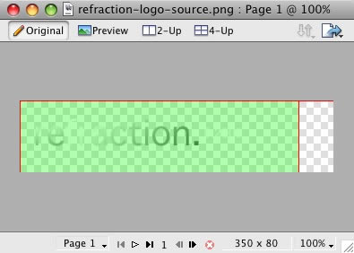
Step 2
Next, double click on the logo. This will activate the text tool so you can edit the element. Highlight the entire text box with your cursor and type your text instead (such as your company name.)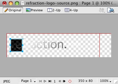
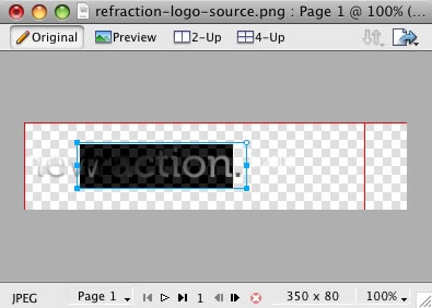
Perform the same actions for the slogan/date
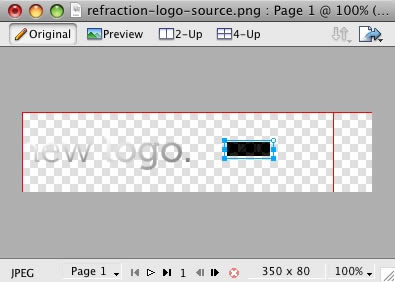
Step 3
Next, reactivate the Web Layers slice. As you did in the initial step, select the eye icon to make it visible and subsequently making the slices visible on the canvas. Select the logo slice, either on the canvas itself or in the Web Layers folder. If you find the slice is too small, hover your cursor over the blue points around the slice and drag it to a new size.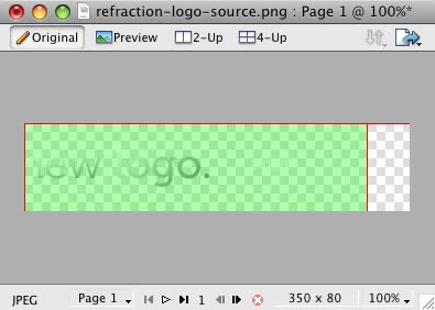
Step 4
To export your logo, right click on the green slice that is situated above your new logo. A popup menu should appear with numerous options. The value we want to deal with is "Export Selected Slice...". As the name suggests, this option will export/save this slice only out of the entire source window.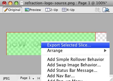
Step 5
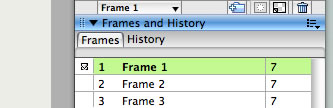
If you are new to Fireworks, you may be wondering why it appears that there is only one style variation in the source. This is not the case as we take advantage of the Frame features of Fireworks. You need to simply switch frames to see all the other style variation sources.There are a few ways to change frames and we will show 2 methods that you can use.
In the right column where you find the Layers toolbar including the Web Layers area, you should see another tab/toolbar named Frames. Just left click on the title Frames to enter the frames area. Then you can click on either of the frames which are named to show which style variant is on that particular frame.
The second method is the most easiest and simplistic. At the bottom of the Fireworks canvas is a row of buttons, arrows just as previous and next. Select the arrows to switch between frames.
 [span class=attention]By default, the source should set the export file format to PNG32. If this is not the case, you will need to change your Fireworks export settings. Firstly, expand the Optimise & Align taskbar in the upper right of Fireworks. From the available dropdowns, select PNG32.[/span]
Step 6
Once you have successfully edited then exported your new logo, you will need to upload it to your server. This process is best done via a FTP client such as Filezilla- Open your FTP client on your local computer.
- Login to your web server where Refraction is installed.
- Navigate to the /templates/rt_refraction_j15/images/main/*style* directory.
- Upload logo.png (and any other logo related images) to this directory (You may need to browse on the local panel in the FTP client to find where you have exported your logo).
- Clear your browser cache before viewing such as using the keyboard commands on Windows, Ctrl+F5.
Configuration
- Detalles
- Categoría de nivel principal o raíz: Contenidos
|
|
|
|
|
|
|
|
|
|
|
|
|
|
|
|
|
|
|
|
|
|
|
|
|
|
|
|
|
|
Preset Style
The template is bundled with 8 pre-made style variants that can be easily and quickly chosen from the template configuration. There is also an option for Custom which you will choose if you do not wish to use the preset styles. [span class=attention]NOTE: The body style, background style and primary colour options will not work unless you click Custom in the Preset Styles section.[/span]Colour Chooser Options
If you selected Custom in the Preset Styles option, you will now have a choice of several options to customise your sites colour scheme. Therefore, you can either manually type your desired colour into the input field or select the colour from the popup.The names of the various selections denote the area that they apply to. [span class=alert]Click the Custom Styles button in the toolbar to output your custom style configuration into the Custom Config output box, underneath all the params. You will use these values in the styles.php file to customise your own defaults.[/span]
Display Frontpage Component
This setting allows you to select whether the frontpage area (where content items are placed) is active or not. This is useful if you wish to have an entirely modular frontpage and no article-based content.IE6 Warning
Warn your visitors using Internet Explorer 6 to upgrade to a more secure version with this toggle. This option activates a javascript based dropdown in IE6 at the top of the template where a description of why IE6 is a redundant browser is visible. The warning will only appear once as it is stored via a cookie.Font Family
You can choose which font you would like to use for your entire website, these are all web standard fonts.Font Spans
Set to Enable or Disable Font Spans. Font Spans refer to the multi-coloured effect on titles, such as module headers.Input Style
Set to Enable or Disable Input Styles. This is the javascript enabled custom styling for radio icons and similar inputs such as in the Poll. You can see these icons in the params above.Input Style Exclusion
Set the IDs and Classes of elements you wish to be excluded from the input styling.Feature Effects
Enable or Disable the hover effects for the Feature modules.Template Width
This template configuration option allows you to easily change the width of the template itself, simply change the number to another pixel value.Left Inset Width
This template configuration option allows you to easily change the width of the left inset position, simply change the number to another pixel value.Right Inset Width
This template configuration option allows you to easily change the width of the right inset position, simply change the number to another pixel value.Splitmenu Location
One of the template's menu options is splitmenu which displays the first level items in the horizontal menu bar and the 2nd in a side column module. This option allows you to choose between the left column or the right column.Default Font
This option allows you to choose what the font size will be, you have 3 options to choose from, these are small, default and large.Panel Trigger
Set the value(s) that are the triggers for the panel. These can be a link as present on our site or any other HTML element that you wish such as div.blue. You use CSS strings as values for the trigger(s).Panel Fixed Height
Enable or Disable the fixed height of the Panel.Panel Height
Set the pixel value for the height of the Panel.Panel Opacity
Set the opacity level for the panel, any decimal value between 0 and 1 such as 0.5.Panel Top Autoscroller
When enabled, when the trigger is activated, the page will automatically scroll to the top to see the variation chooser.Panel Click to Close
Set the closing mechanism to be a click.Panel Close Button
Enable or Disable the Panel close button.Show Main Logo
Choose whether the logo area has the template logo image, or is the logo module position. If this option is set to no and there are no modules assigned to the logo area, it will collapse completely.Show Copyright
Choose whether the copyright area has the RocketTheme logo image, or is the footer module position. If this option is set to no and there are no modules assigned to the footer area, it will collapse completely.Show Top Button
This setting allows you to disable the top button in the lower right of the template.Mootools / Javascript Compatibility
Enable or disable js compatibility mode for better compatibility with non mootools based js libraries. Warning, setting to "true" will cause several js template features to not work properly.Menu Type
Refraction is bundled with 4 menu options, 3 of which are integrated menu approaches. These are splitmenu, moomenu, suckerfish and module. Splitmenu displays the 1st level menu items in the horizontal bar and the 2nd in the side column; moomenu and suckerfish display the menu items in dropdown lists with moomenu having a javascript powered approach; and the module options turns the menu bar into the toolbar module position so you can insert modules into the area (this will disable the menu however). You can also select none so the entire horizontal menu does not appear.Drop Down Rows per Column
The maximum number of menu item rows per column. Applicable only to MooMenu and Suckerfish, as well as second+ menu levels.Drop Down Columns
The number of columns for a dropdown. Applicable only to MooMenu and Suckerfish, as well as second+ menu levels.Multi-Column Level
The menu level that is affected by the multiple column dropdown affect. Set to 0 to affect all dropdown levels or set a number greater than 0 to specify a particular level with the multiple column function. Applicable only to MooMenu and Suckerfish.Menu Name
The following parameter controls which Joomla menu is loaded for the horizontal navigation bar, by default this is mainmenu but you can change it to whatever menu such as othermenu.Menu Options
- Detalles
- Categoría de nivel principal o raíz: Contenidos
Refraction features an array of elegant, professional and exclusive menu systems. Here you can read an overview of the available menu configuration options.
[span class=attention] Video Tutorial Currently Available! Launch the Joomla Menu Setup Video Tutorial now![/span]Selecting your Menu Style
Refraction allows you to choose from 4 menu modes:
[list class=bullet-1][li]RokMooMenu - The advanced menu system based on the ever popular Suckerfish menu style, featuring mootools powered transitions and effects.[/li] [li]Suckerfish - The versatile dropdown menu is an option in combination with RokMooMenu to minimize library conflicts and improve site performance.[/li] [li]SplitMenu - The venerable SplitMenu is a solid choice for navigation. It works by rendering the top-level menu options horizontally, and the submenu/child items are rendered in a module on the side.[/li] [li]No Menu Bar - Setting the menu type to "none" will remove the horizontal menu as well as the menu bar graphics making the header flush with the main content giving you more control over the appearance of your site.[/li][/list]You can designate which menu type you want to use on your site with a single control in the template configuration.
DropColumn Menu
A brand new menu function, the Multiple Drop Column ability. This applies only to MooMenu and Suckerfish and allows for multiple drop down columns instead of the typical single variant. The advanced options with this feature, allow you to choose the number of columns, specify individual menu levels which exhibit the behaviour and restrict the number of columns per row. A truly versatile new feature as showcased on this demo.The Powerful & Popular RokMooMenu
This menu has been developed from scratch using the latest and greatest MooTools JavaScript framework. The RokMooMenu is a highly advanced and fully customisable menu system. Some of the great features include:-[list class=bullet-1][li]Hover support for IE6 using the sfHover javascript class just like in Suckerfish.[/li] [li]Fully degradable to standard SuckerFish menu if javascript is not supported.[/li] [li]Configurable mouse-out delay to allow for accidental mousing out of the menu.[/li] [li]Completely customizable animation effects using MooTools transitions. Can be configured in X and/or Y directions.[/li] [li]Support for fade-in transparency[/li] [li]Experimental support for IE6 z-index bug using the iFrame hack.[/li][/list] An example configuration as used in the demo:
|
|
|
|
|
|